


You have likely heard the term ‘infographic’ mentioned frequently in social media, articles, or even previous blogs. However, without a background in design, it can be unclear what everyone means when they say ‘infographic’. What differentiates it from other deliverables? Is an infographic just an image with data? Not necessarily!
An infographic is a clear and visual representation of data and information, leaning on design elements such as imagery, icons, charts, and diagrams to tell a cohesive story. Ideally, the story is told through combining visuals and text within a single document, making it a powerful tool for synthesizing research in a visually appealing way.
While they are just one of our many deliverable options, infographics can be a valuable asset to your project.

When compared to an industry-standard report, the main draw of an infographic is its ability to condense large amounts of information into a single, shareable, cohesive document. It leans into the storytelling aspect of research, linking multiple points of information in an easily digestible format for researchers and non-researchers alike. This added level of visualization has an advantage over typical reporting, where there can be limits in how data is presented.
While not as common as research reports, an infographic is a deliverable option that can add value to any research project. Often created in addition to a report or presentation, there are various types:
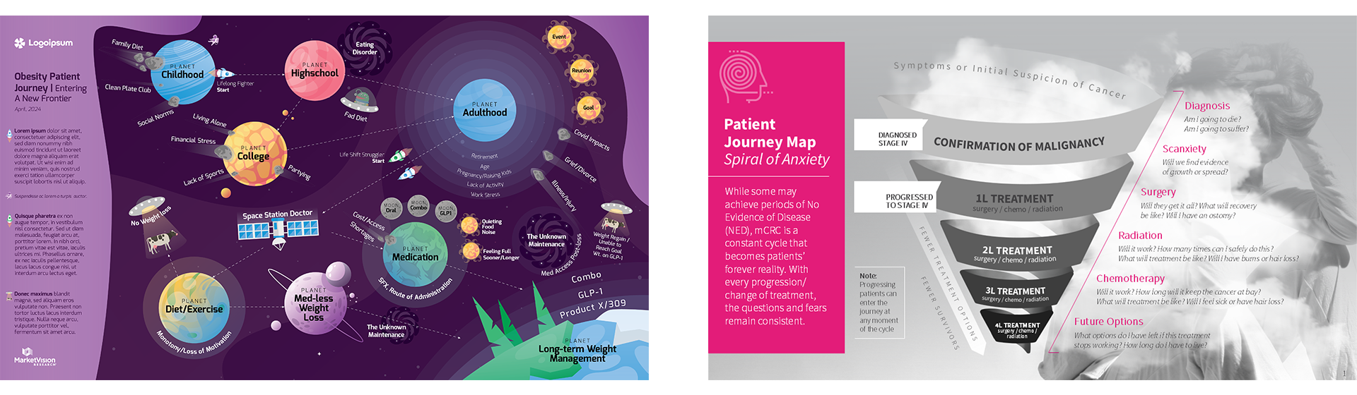
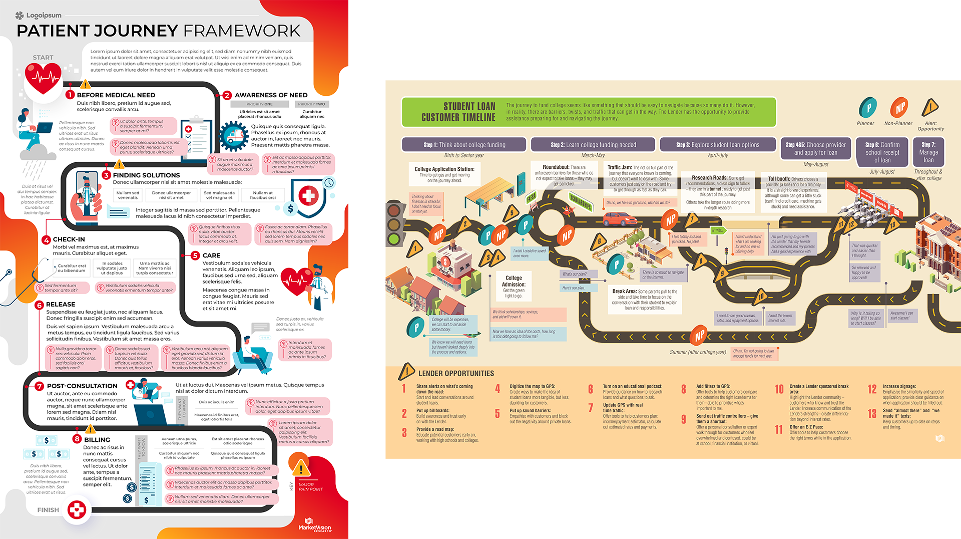
Some of the most common types, journey or process infographics are best suited to show step-by-step sequences, stages, or systems. Some examples include a patient treatment journey and a path-to-purchase journey.
Key elements:
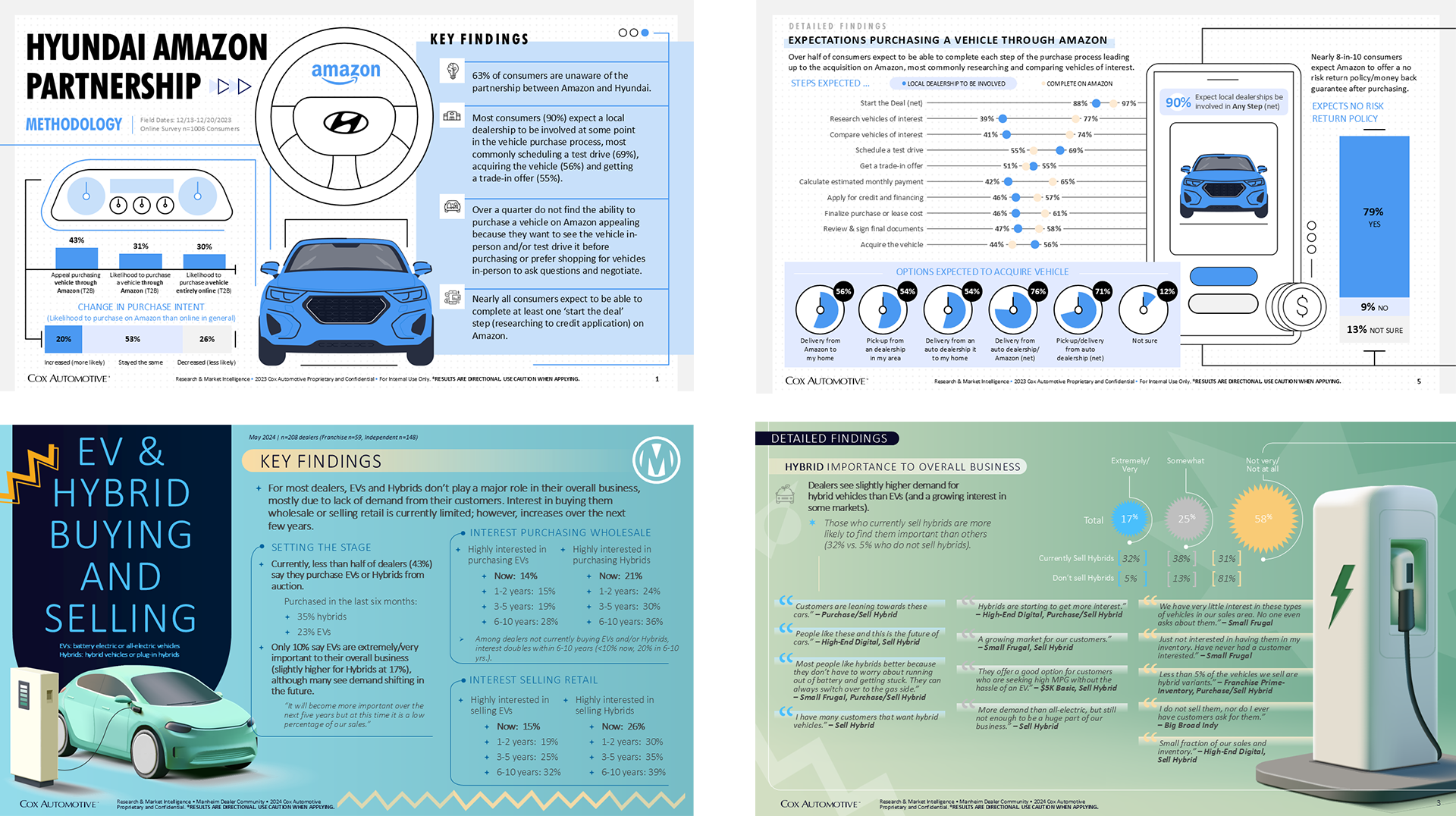
As the name suggests, charts and graphs are a key feature in this type of infographic, as it often blends qualitative and quantitative information. Usually, it’s best to find a central theme and use that to tell the story, rather than including all the findings.
Key elements:
Used to showcase the history of something or a sequence of events, this is similar to the journey infographic - and sometimes can be called a journey too. However, the main difference is that time or dates are a key factor since chronological order is important.
Key elements:
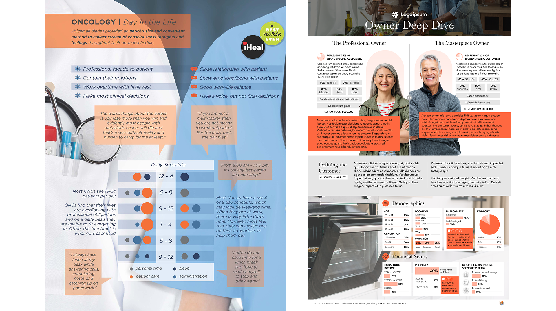
This helps provide clarity between two or more ideas, concepts or objects. Especially helpful if there are multiple perspectives – think pro/cons, similarities/differences, etc.
Key elements:
Having created and encountered numerous infographics over the years, I've observed that although every project and narrative is distinct, certain key best practices can elevate a good infographic to a truly great one.
Traditionally, infographics are single-page documents designed to provide a cohesive and comprehensive story. This helps keep the infographic straightforward and easily consumable by any audience. Although the one-page format is generally recommended, we are able to produce multi-page infographics, as demonstrated in some of the examples shown.
To determine if an infographic can help you socialize your research story, speak with your project team about your options. Who is the target audience? What are the objectives? What would you like to share as a project takeaway? Asking these questions will help guide how best to deliver your research findings in the most effective way possible. Who knows! An infographic might just be the right tool for your project.


